
Viability

70% of gamers express interest in tools that can help them improve performance, as per surveys in competitive and casual gaming communities. "Source"

Platforms like Twitch and YouTube Gaming have grown by over 75% in viewership in recent years. Content creators need tools to automate and enhance highlight generation and overlays, a feature GameSense AI can offer. Source

Around 65% of gamers report they would spend time on personalized training to improve their skills if given the opportunity, GameSense AI’s personalized training modules align with this demand, creating a clear value proposition.
Polls were crucial to the development of the direction on this application and trying to intergrate the paradox of specificity.
How often would you use an AI coach to improve your gaming skills?

Which feature would you find most valuable in an AI coach?

Concolusion
The results narrowed down the research topics, these topics will have to be further researched to find if other application offer this service and to what degree could we improve if nesssery on existing systems.
To get an idea of the Space we were entering into we did some competitive benchmarking with a SWOT analysis. this helped with insites on were to aim our efforts, what areas to build on and features that may need growth in order to incapsulate the market.


Key Insight 1
Players rely on guesswork to improve because feedback is unclear or missing.
Implication: The product must clearly explain why mistakes happen
Key Insight 2
Stats are not actionable.
Users see data (kills, accuracy)But don’t know what to do with it
Implication: Translate stats into specific actions
Key Insight 3
Improvement lacks structure.
No clear path from gameplay. Training is disconnected from performance
Implication: Create a guided improvement loop
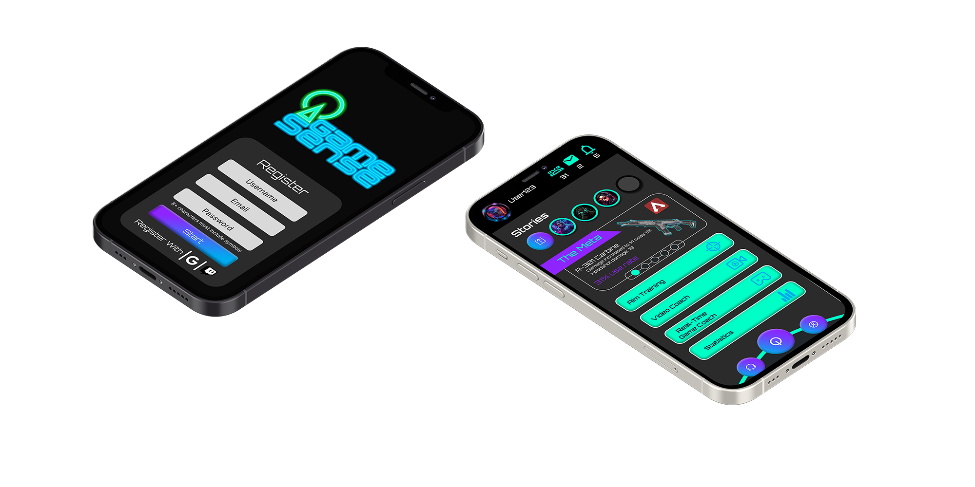
How this shaped the product
Introduced Video Coach to analyse gameplay and highlight mistakes
Added targeted training recommendations based on performance
Designed a Play - Analyse - Train - Improve loop to guide behaviour


When developing these low-fi designs of the onboarding process i came across some flaws i wanted to build solutions to fix, these included the colapsable menu. while i thought this was a good idea at the time for a product with multiple features, this design choice just wasnt as usefull as i wanted it to be, i screpped this for the tab toolbar menu, stylised to fit the products personallity.
Secondly was the format of the feature butons the square buttons were to clunky and unnessesery, yes they were an easy tap target, but these types of butons made it hard to expand on more features if needed and just did not fit the feal of the product. in this case o opted for a more sleek bar buton system with smaller icons.


