


User interviews were conducted on existing competitive applications. I selected Aer Lingus, an industry leader, and Eurowings, a lesser-known application, to identify factors contributing to their success and challenges.
The interviews were carefully analyzed and timestamped, with observations categorized into positive, neutral, and negative aspects. This method provided a comprehensive understanding of the interview results.
In order to properly identlfy issues to overcome when finding the best user experince i designed to produce an affinity diagram in order t better understand these interviews.Firstly i organised Key quotes and findings into there groups, color-coded for positive, Negative and natural interactions.
top-01.png)
_end-03.png)
To pinpoint areas for improvement and foster empathy with stakeholders, I found it essential to create a customer journey map.
-01.webp)

Danger of Features
To many options available to users slowing the path of purchase.

Application is not forthcoming
users must work for basic information.

Users are overwhelmed
Upgrade promotions lack white space

No Forgiveness
The Applications lack forgivness increase customer dropoff.

Paradox of Specificity
pull back on features and focuse on user goals

Be Forthcoming
Provide Customers Scannable information for every step and requirment.

Information Architecture
Class options could be condensed and prioritised with an option of a more information button .

Forgiveness
Users should be reminded of their choices with options to edit selection.
The objective of this initiative is to conduct an in-depth analysis of the optimal user journey, with a focus on crafting a seamless and engaging experience for the majority of users who will access the application in this manner. Our aim is to streamline the booking process, minimizing errors and enhancing user satisfaction through essential validation and predictable design elements.
-01.webp)
-02.webp)
-03.webp)
-04.webp)
.pdf)


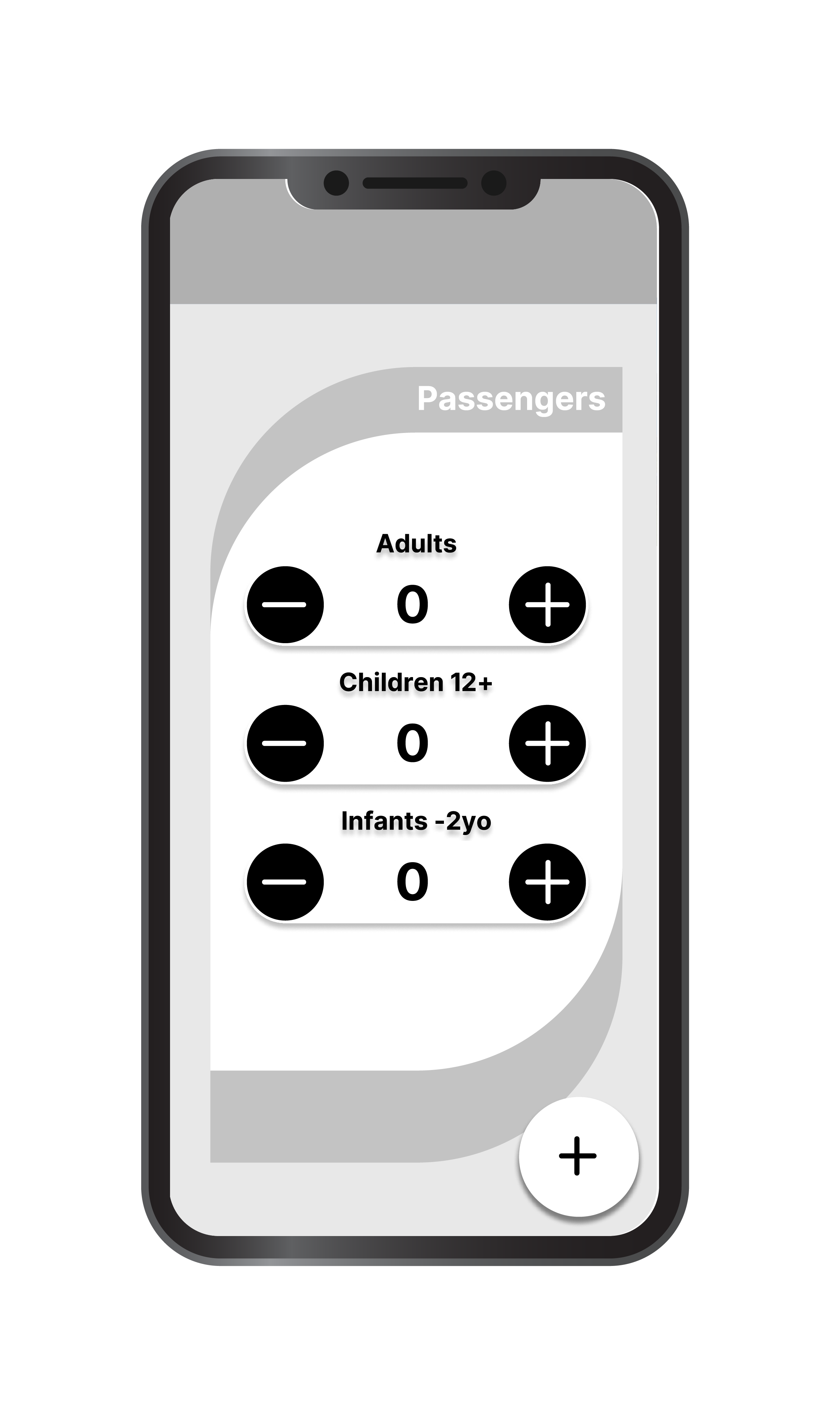


Building on insights gathered from the low-fidelity prototypes, the medium-fidelity designs offer a more refined user experience, focusing on solving the core problems of clutter, bad UI, and misinformation. In this stage, I enhanced the layout by simplifying navigation and creating clearer visual hierarchies, ensuring important information stands out. Interactive elements like buttons and drop-down menus were introduced, allowing users to test a more realistic flow. This version emphasizes usability, balancing aesthetics with functionality, while remaining flexible for future user feedback and iterations.
This iteration addressed the top pain points by prioritising clarity and predictability. Navigation bar reorganisation reduced the number of steps, and a clearer hierarchy ensured pricing and key choices were visible without scrolling.

Key Learnings
Users respond more positively to simplified choice architecture than feature abundance.
Early sketches were invaluable for aligning assumptions before committing to layouts.
If time permitted, usability testing would validate whether the simplified navigation improves task completion rates.
This project reinforced the importance of reducing cognitive load in complex, multi-step experiences such as flight booking. Through research and iterative design, the focus shifted from adding features to clarifying decisions and prioritising essential information at each stage of the journey.Working through low- and medium-fidelity prototypes highlighted how early structure and flow decisions have a greater impact on usability than visual polish alone. Simplifying navigation, grouping related information, and making key actions more predictable helped create a clearer and more forgiving booking experience.If this project were to continue, the next step would be usability testing with real users to validate task completion, identify friction points, and measure confidence during the booking process. Insights from testing would inform further refinement of the flow, interaction patterns, and information hierarchy.
an intelligent assistant that enhances gaming performance, learning, and enjoyment for casual and competitive players
